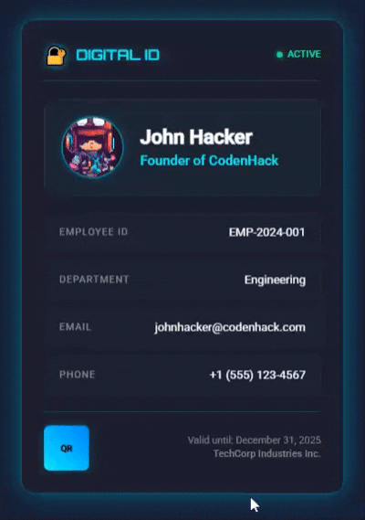
Neon Profile Card
NETRUNNER PROJECT
Create a glowing digital ID card with avatar and info.
Work Time 1.5h
5/5
Introduction
A Subtle Glowing Digital ID Card is a clean, professional digital identification card built entirely with HTML and CSS. This project demonstrates modern web design techniques including:
- Subtle Glow Effects: Gentle cyan borders and shadows for professional appearance
- No JavaScript Required: Pure CSS animations and interactions
- Responsive Design: Works perfectly on all device sizes
- Single Column Layout: Clean, organized information display
- Professional Appearance: Perfect for corporate ID cards
The card features a dark theme with elegant cyan accents, smooth hover animations, and a compact layout that displays essential employee information in an organized manner.
🎬 Live Result Preview
Watch the subtle glow effects and smooth hover animations in action!
Key Features
- Header Section: Digital ID logo with active status indicator
- Profile Section: Avatar image with name, title, and department
- Information Grid: Employee details in single column layout
- Footer Section: QR code placeholder and company information
- Hover Effects: Subtle animations and enhanced glow on interaction
Getting Started
Prerequisites
- Basic knowledge of HTML and CSS
- A modern web browser (Chrome, Firefox, Safari, Edge)
- A text editor (VS Code, Sublime Text, Notepad++)
Project Structure
Neon Profile Card/
├── index.html          # Main HTML structure
├── styles.css          # CSS styling with subtle glow effects
Tasks for Each Step
Step 1: HTML Structure Setup
Task: Create the basic HTML document
- Set up DOCTYPE and HTML tags
- Add meta tags for character encoding and responsive viewport
- Link external CSS stylesheet
- Import Google Fonts (Orbitron and Roboto)
Code:
html
<!DOCTYPE html>
<html lang="en">
  <head>
    <meta charset="UTF-8" />
    <meta name="viewport" content="width=device-width, initial-scale=1.0" />
    <title>Subtle Glowing Digital ID Card</title>
    <link rel="stylesheet" href="styles.css" />
    <link
      href="https://fonts.googleapis.com/css2?family=Orbitron:wght@400;600&family=Roboto:wght@300;400;500&display=swap"
      rel="stylesheet"
    />
  </head>
  <body>
    <!-- Content will go here -->
  </body>
</html>
What This Achieves:
- Establishes the document foundation
- Ensures proper character encoding
- Makes the design responsive
- Provides modern typography
Step 2: Container and Card Structure
Task: Build the main card container
- Create outer container for centering
- Add main ID card element
- Set up proper HTML structure with semantic elements
Code:
html
<body>
  <div class="container">
    <div class="id-card">
      <!-- Card content will go here -->
    </div>
  </div>
</body>
What This Achieves:
- Centers the card on the page
- Provides the main card wrapper
- Creates proper document hierarchy
Step 3: Header Section
Task: Create the header with logo and status
- Add logo section with lock emoji icon
- Include "DIGITAL ID" text with special font
- Create status indicator with green dot
- Add "ACTIVE" status text
Code:
html
<div class="header">
  <div class="logo">
    <div class="logo-icon">🔐</div>
    <span class="logo-text">DIGITAL ID</span>
  </div>
  <div class="status">
    <div class="status-dot"></div>
    <span>ACTIVE</span>
  </div>
</div>
What This Achieves:
- Establishes brand identity
- Shows card validity status
- Creates visual hierarchy
Step 4: Avatar and Profile Section
Task: Build the profile display area
- Create circular avatar container
- Add profile image with proper sizing
- Include name, job title, and department
- Arrange elements horizontally
Code:
html
<div class="avatar-section">
  <div class="avatar-container">
    <div class="avatar">
      <img
        src="https://images.unsplash.com/photo-1472099645785-5658abf4ff4e?w=150&h=150&fit=crop&crop=face"
        alt="Profile Avatar"
      />
    </div>
  </div>
  <div class="avatar-info">
    <h2>John Alexander</h2>
    <p class="title">Senior Software Engineer</p>
    <p class="department">Technology Division</p>
  </div>
</div>
What This Achieves:
- Displays personal identification
- Shows professional information
- Creates visual balance
Step 5: Information Grid
Task: Create the data display section
- Build single column layout for information
- Add employee ID, department, email, and phone
- Create label-value pairs
- Implement hover effects
Code:
html
<div class="info-grid">
  <div class="info-item">
    <span class="label">Employee ID</span>
    <span class="value">EMP-2024-001</span>
  </div>
  <div class="info-item">
    <span class="label">Department</span>
    <span class="value">Engineering</span>
  </div>
  <div class="info-item">
    <span class="label">Email</span>
    <span class="value">john.alexander@company.com</span>
  </div>
  <div class="info-item">
    <span class="label">Phone</span>
    <span class="value">+1 (555) 123-4567</span>
  </div>
</div>
What This Achieves:
- Organizes essential information
- Provides clear data structure
- Enhances user interaction
Step 6: Footer Section
Task: Complete the card with footer
- Add QR code placeholder
- Include validity information
- Display company name
- Create proper spacing and borders
Code:
html
<div class="footer">
  <div class="qr-code">
    <div class="qr-placeholder">
      <span>QR</span>
    </div>
  </div>
  <div class="footer-text">
    <p>Valid until: December 31, 2025</p>
    <p class="company">TechCorp Industries Inc.</p>
  </div>
</div>
What This Achieves:
- Provides additional functionality
- Shows card expiration
- Completes the design
Step 7: CSS Styling Foundation
Task: Set up CSS base styles
- Reset default browser margins and padding
- Create dark gradient background
- Set up body layout with flexbox
- Define base typography
Code:
css
* {
  margin: 0;
  padding: 0;
  box-sizing: border-box;
}

body {
  font-family: "Roboto", sans-serif;
  background: linear-gradient(135deg, #1a1a2e 0%, #16213e 100%);
  min-height: 100vh;
  display: flex;
  align-items: center;
  justify-content: center;
  color: #ffffff;
}

.container {
  display: flex;
  justify-content: center;
  align-items: center;
  min-height: 100vh;
  padding: 20px;
}
What This Achieves:
- Removes browser inconsistencies
- Creates professional dark theme
- Centers content properly
- Establishes readable text
Step 8: Card Container Styling
Task: Style the main card element
- Set fixed dimensions (360px width)
- Apply dark background color
- Add subtle cyan border
- Implement glow effects with box-shadows
- Add smooth transitions
Code:
css
.id-card {
  position: relative;
  width: 360px;
  background: #1e1e2e;
  border-radius: 16px;
  padding: 25px;
  border: 1px solid rgba(0, 255, 255, 0.3);
  box-shadow: 0 0 20px rgba(0, 255, 255, 0.2), 0 0 40px rgba(0, 255, 255, 0.1);
  transition: all 0.3s ease;
}

.id-card:hover {
  transform: translateY(-3px);
  box-shadow: 0 0 25px rgba(0, 255, 255, 0.3), 0 0 50px rgba(0, 255, 255, 0.15);
}
What This Achieves:
- Creates consistent card appearance
- Implements the signature glow effect
- Ensures smooth animations
Step 9: Header Styling
Task: Style the header section
- Use flexbox for logo and status layout
- Apply special font (Orbitron) to logo text
- Add text shadows for glow effect
- Style status dot with animation
- Create separator border
Code:
css
.header {
  display: flex;
  justify-content: space-between;
  align-items: center;
  margin-bottom: 20px;
  padding-bottom: 15px;
  border-bottom: 1px solid rgba(0, 255, 255, 0.2);
}

.logo {
  display: flex;
  align-items: center;
  gap: 8px;
}

.logo-text {
  font-family: "Orbitron", monospace;
  font-weight: 600;
  font-size: 16px;
  color: #00ffff;
  text-shadow: 0 0 8px rgba(0, 255, 255, 0.4);
}

.status-dot {
  width: 6px;
  height: 6px;
  border-radius: 50%;
  background: #00ff88;
  box-shadow: 0 0 6px #00ff88;
  animation: gentlePulse 3s ease-in-out infinite;
}

@keyframes gentlePulse {
  0%,
  100% {
    opacity: 1;
    transform: scale(1);
  }
  50% {
    opacity: 0.8;
    transform: scale(1.1);
  }
}
What This Achieves:
- Professional header appearance
- Futuristic logo styling
- Animated status indicator
- Clear section separation
Step 10: Avatar Section Styling
Task: Style the profile section
- Create horizontal flexbox layout
- Style circular avatar with glowing border
- Add subtle background and borders
- Implement hover effects
- Ensure proper image sizing
Code:
css
.avatar-section {
  display: flex;
  align-items: center;
  gap: 18px;
  margin-bottom: 20px;
  padding: 18px;
  background: rgba(0, 255, 255, 0.03);
  border-radius: 12px;
  border: 1px solid rgba(0, 255, 255, 0.1);
}

.avatar {
  width: 70px;
  height: 70px;
  border-radius: 50%;
  overflow: hidden;
  border: 2px solid rgba(0, 255, 255, 0.4);
  box-shadow: 0 0 12px rgba(0, 255, 255, 0.2);
  transition: all 0.3s ease;
}

.avatar:hover {
  border-color: rgba(0, 255, 255, 0.6);
  box-shadow: 0 0 18px rgba(0, 255, 255, 0.3);
}

.avatar img {
  width: 100%;
  height: 100%;
  object-fit: cover;
}
What This Achieves:
- Professional profile display
- Interactive avatar elements
- Consistent spacing and alignment
Step 11: Information Grid Styling
Task: Style the data display
- Implement single column flexbox layout
- Style individual info items
- Add hover effects and transitions
- Create label-value styling
- Ensure proper spacing
Code:
css
.info-grid {
  display: flex;
  flex-direction: column;
  gap: 12px;
  margin-bottom: 20px;
}

.info-item {
  padding: 12px 16px;
  background: rgba(0, 255, 255, 0.02);
  border-radius: 8px;
  border: 1px solid rgba(0, 255, 255, 0.08);
  transition: all 0.3s ease;
  display: flex;
  justify-content: space-between;
  align-items: center;
}

.info-item:hover {
  background: rgba(0, 255, 255, 0.05);
  border-color: rgba(0, 255, 255, 0.2);
  box-shadow: 0 0 8px rgba(0, 255, 255, 0.1);
}

.label {
  font-size: 11px;
  color: #888;
  text-transform: uppercase;
  letter-spacing: 0.8px;
  font-weight: 500;
}

.value {
  font-size: 13px;
  color: #ffffff;
  font-weight: 400;
  text-align: right;
}
What This Achieves:
- Clean information display
- Interactive data elements
- Professional appearance
Step 12: Footer Styling
Task: Style the footer section
- Create QR code placeholder with gradient
- Style company information
- Add proper borders and spacing
- Ensure responsive layout
Code:
css
.footer {
  display: flex;
  justify-content: space-between;
  align-items: center;
  padding-top: 15px;
  border-top: 1px solid rgba(0, 255, 255, 0.2);
}

.qr-code {
  width: 50px;
  height: 50px;
}

.qr-placeholder {
  width: 100%;
  height: 100%;
  background: linear-gradient(45deg, #00ffff, #0088ff);
  border-radius: 6px;
  display: flex;
  align-items: center;
  justify-content: center;
  font-size: 10px;
  font-weight: bold;
  color: #000;
  box-shadow: 0 0 8px rgba(0, 255, 255, 0.3);
}

.company {
  font-weight: 500;
  color: #00ffff;
  font-size: 12px;
}
What This Achieves:
- Complete card design
- Professional footer appearance
- Functional QR code area
Step 13: Hover Effects and Animations
Task: Implement interactive elements
- Add card lift effect on hover
- Enhance glow effects on interaction
- Style info item hover states
- Create smooth transitions
Code:
css
/* Card hover effect */
.id-card:hover {
  transform: translateY(-3px);
  box-shadow: 0 0 25px rgba(0, 255, 255, 0.3), 0 0 50px rgba(0, 255, 255, 0.15);
}

/* Info item hover effects */
.info-item:hover {
  background: rgba(0, 255, 255, 0.05);
  border-color: rgba(0, 255, 255, 0.2);
  box-shadow: 0 0 8px rgba(0, 255, 255, 0.1);
}

.info-item:hover .value {
  color: #00ffff;
}

/* Avatar hover effects */
.avatar:hover {
  border-color: rgba(0, 255, 255, 0.6);
  box-shadow: 0 0 18px rgba(0, 255, 255, 0.3);
}
What This Achieves:
- Enhanced user experience
- Professional interactivity
- Smooth visual feedback
Step 14: Responsive Design
Task: Make the card mobile-friendly
- Add media queries for small screens
- Adjust card width for mobile
- Stack elements vertically on small screens
- Ensure proper text alignment
Code:
css
@media (max-width: 480px) {
  .id-card {
    width: 320px;
    padding: 20px;
  }

  .avatar-section {
    flex-direction: column;
    text-align: center;
    gap: 15px;
  }

  .info-item {
    flex-direction: column;
    gap: 8px;
    text-align: center;
  }

  .value {
    text-align: center;
  }
}
What This Achieves:
- Mobile compatibility
- Consistent experience across devices
- Professional mobile appearance
Conclusion
What You've Accomplished
By following these steps, you've created a professional digital ID card that demonstrates:
- Modern CSS Techniques: Flexbox layouts, transitions, and animations
- Professional Design: Clean, organized information display
- Responsive Layout: Works on all device sizes
- Interactive Elements: Smooth hover effects and animations
- No JavaScript Required: Pure CSS solution for better performance
Key Learning Outcomes
- HTML Structure: Semantic markup and proper organization
- CSS Layout: Flexbox for modern layouts
- Visual Effects: Box-shadows and transitions for glow effects
- Responsive Design: Media queries for mobile compatibility
- Performance: CSS-only animations for smooth interactions
Next Steps
- Customize Colors: Modify the cyan theme to match your brand
- Add Content: Replace placeholder information with real data
- Enhance Features: Add QR code generation or additional fields
- Deploy: Use the card in your web applications or portfolios
Technical Benefits
- Fast Loading: No external JavaScript dependencies
- Easy Maintenance: Simple HTML and CSS structure
- Cross-Platform: Works on all modern browsers
- Scalable: Easy to modify and extend
- Professional: Suitable for business and portfolio use
Built with ❤️ using only HTML & CSS - Perfect for Professional Use!